Optimise self-hosted payment page
Make it easy and enjoyable to use
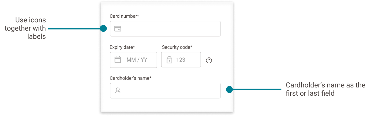
- Customer's name field should be on the first or last field when inputting a card payment method. This is the most natural and logical order to the end users.
- Use both labels and icons for fields for functionality and visual appeal.
- Ensure your payment page is Web Content Accessibility Guidelines (WCAG) compliant to make sure anyone including those with visual impairment and disabilities is able to use and complete the payment.
- Use coloured icons with text on confirmation pages. This will help make the pages look more visibly different, so users can clearly see what happened to their transaction. It is better for accessibility, so users with colour blindness can understand the page more easily.
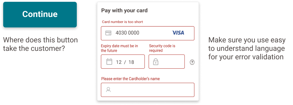
- Make the text as specific and user-friendly as possible, including the error validation text. Use words that makes sense to users and test it out to validate this. For example, where does the 'Continue' button lead you Does it go back to the web shop? Does it mean I can try again?
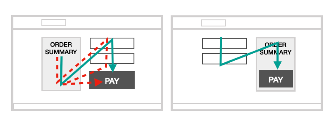
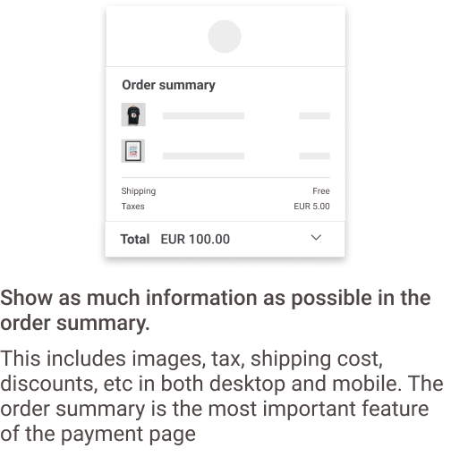
- Customers prefer the Order Summary and Pay button to be close to each other to help customer's confirm what they are purchasing. If not, the pay button should be the last thing they hit and makes sense on the right side of the page.
- Make sure it blends well between the web shop and the payment page. For example, if your main website has a black background, make sure your checkout page uses a similar background colour.
 Your payment was accepted.
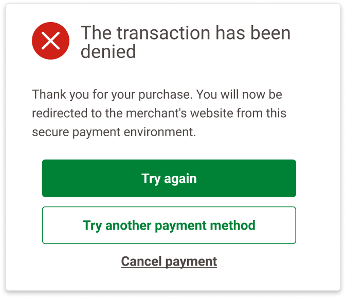
 The transaction has been denied.
Build trust and security
- Show your company name in the URL and use https:// for extra security.
- Use words 'Pay securely'.
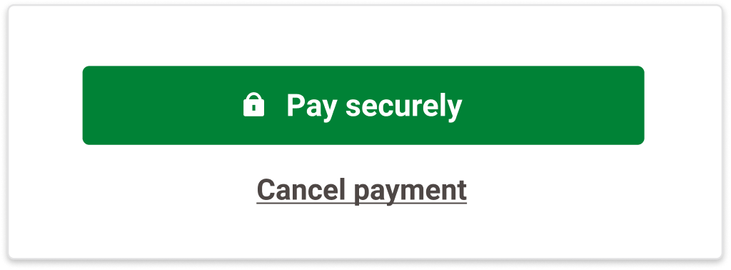
- Use the colour green on Pay buttons and checkmarks to indicate completed steps in the process. Green is associated with positivity and safety. Emotions are important to ensure a successful payment.
- Add a lock icon on the pay button or on the page near the Order Summary.
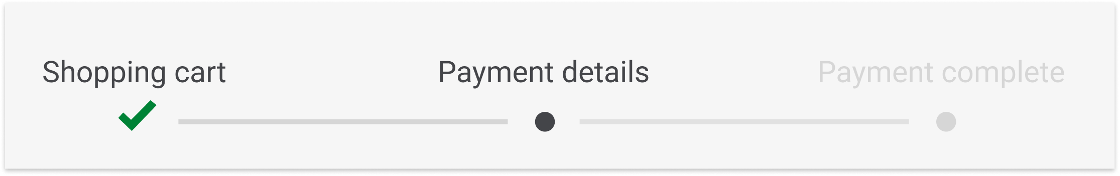
- Include a progress bar to increase confidence in completing transactions. A progress bar helps users know where they are in the checkout journey.
Use as few steps as possible
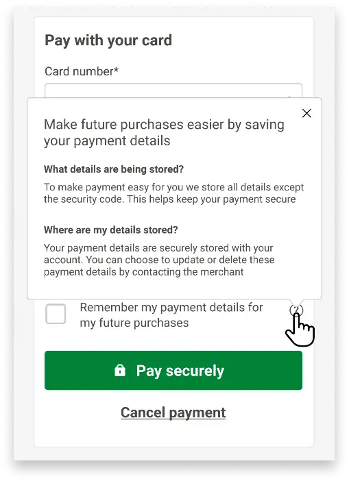
- Help your customers pay faster by saving their payment details with tokenisation. Explain your data protection policy clearly.
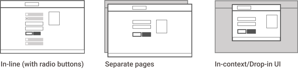
- Using an in-line checkout design can offer users to change between more payment methods quickly and reduces clicks compared to having payment interactions on separate pages. Most believe this is more modern, but some people find it less trustworthy.
- Provide open text fields. Avoid drop-down menus for card input fields. Many people only use keyboards to tab through and fill in forms.
Ensure it is mobile-friendly
- Test your checkout journey on different devices (iOS and Android) and screen sizes to see how it looks and feels for your customer.
- Make sure your design is responsive. Mobile payments have already exceeded desktop payments so it is important to design our payment pages mobile-first.
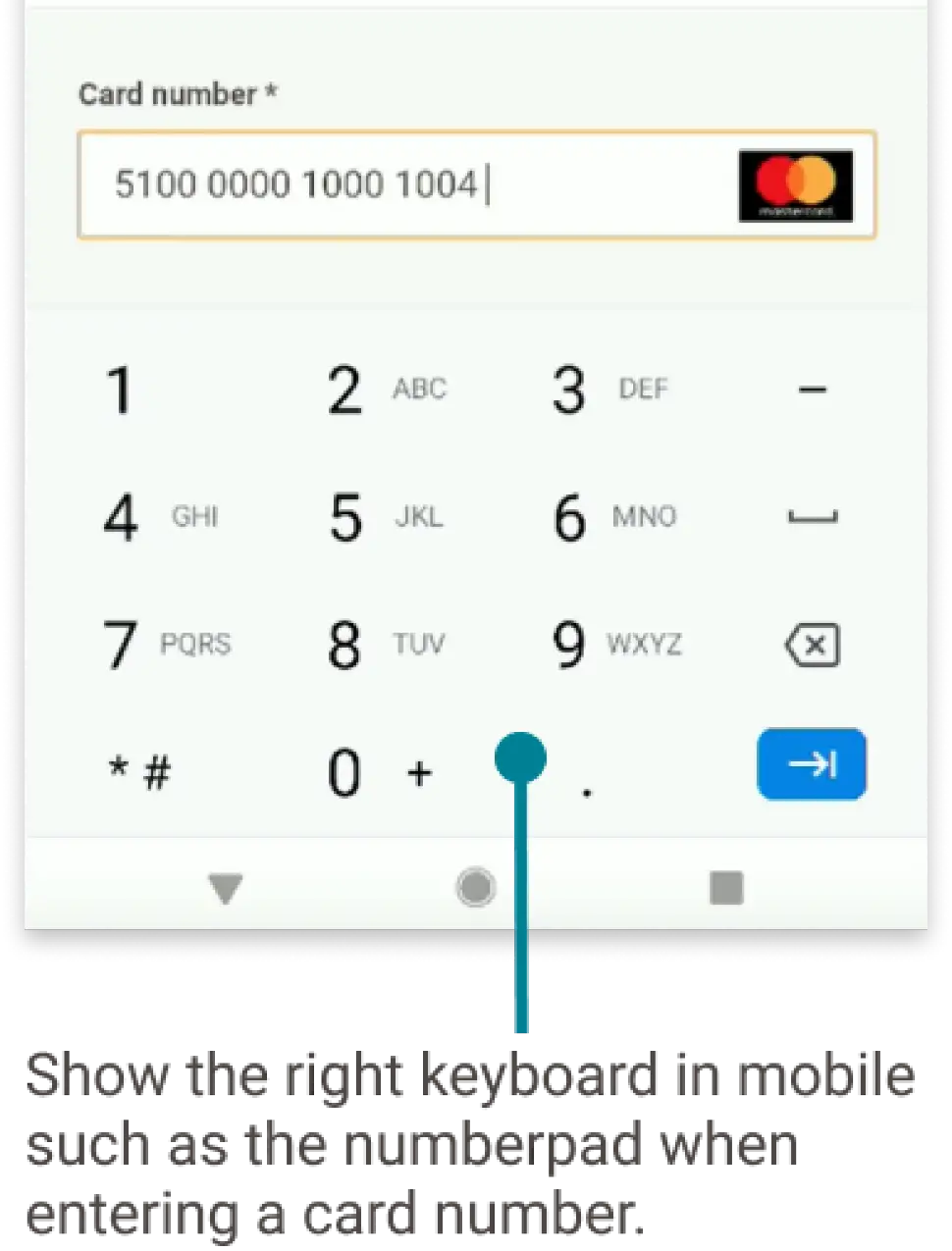
- Show context-appropriate keywords and make data entry easy for your customer. For example, display a number pad when customers have to fill in their card number details.
- Reduce load time of your page. For example, make sure that CSS is optimised and using the right resolution for images to make sure that your customer is not loading bigger files than necessary.
Localise checkout pages
59% of users do not finalize their orders when they do not find their preferred payment methods. Approx. 70% of European consumers likely to search for alternative websites with localized pricing.
- Offering the right payment method makes a difference to the customer.
- Make sure you also show all the logos of the payment methods you offer, so that customers can quickly scan and know what they can pay with.
- Localise your payment page with the relevant language to ease the customer to complete the order.
- Offer the right currency to the user so that they do not have to worry about foreign currency exchange fees.
Provide smart interactions
- Use BIN detection for cards, allowing customers to input any card number without having to choose the brand upfront.
- Incorporate validation through checkmarks after each input field to provide positive reinforcement that the information they provided is correct.
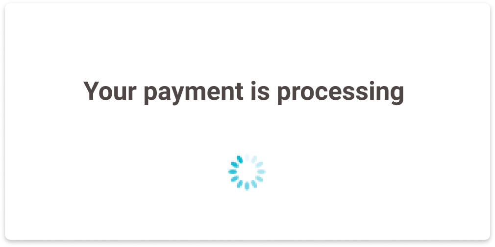
- Sometimes customers click on the same Pay button twice and this could cause the payment to fail. To prevent this, disable buttons when the payment is going through and display a loading modal instead.
- Customers prefer group cards to separate card payment methods. However, do not forget to show all the logos in each group cards.
- Ensure that the order of buttons makes sense to the user to help them complete the order. When we tested a failed transaction, customers would "Try again" first, then "Try another payment method" before they would "Cancel payment".
- Provide full Order Summary details to provide reassurance to complete purchase, even on mobile.
- Provide clear explanations on how data is stored.
- Explain what a security code is.
- Always provide customers with the option to cancel as they want to feel in control of their purchase.
- Offer alternative payment options right away when transactions have failed to not lose out on the transaction opportunity.
- Customers want the option to edit or remove saved cards.
Recommendations
We strongly recommend that you also test your payment page design and complete checkout experience with real customers and analyze their experience with qualitative and quantitative data. No two payment page experiences are the same as it depends on your website's design, the products you sell, your key customer's purchasing behaviours, etc.
The feedback you get directly from your customers will help you further optimise your payment page while you create the optimal experience that is unique for your customers.